Friday, April 29, 2011

Mad Ads

In this post i've chosen to look at adverts that have caught my attention. In a book i recently bought called the one show which is basically a catalogue rating and awarding medals to different pieces of design work, there was an ad for durex. It caught my eye because of the cleverness of it.
                                                                                                              http://farm1.static.flickr.com/45/147761320_b45ad32aa4.jpg


I immediately took a liking to this as the photography is insinuating something quite rude that some viewers may take offence to, however it is not actually saying it. It also means that the viewer has to work a little harder to work out the meaning of the advert, however once they are aware of what the photography implies, it matches the brand that it is advertising well. This said i think that in the absence of the durex logo on the bottom of the image, the product that the adverts are trying to sell would become unclear. I researched some other "clever" adverts, below are some of the adverts i have found, which i believe shows how advertising has changed with the change of technology, and change in people tastes and preferences.


                          http://www.thecoolnews.org/wp-content/uploads/2008/02/image0011.jpg

This advert is clever in the way it is communicating the idea to us, however it is also immediately clear what it is trying to tell the viewer. This is what makes this advert work well and effectivelly. Viral ads work in the same way whether they are on the internet or on the street, as they are able to capture the publics attention quickly and relay their idea.


                                 http://farm3.static.flickr.com/2018/1725723599_1f9f9256f3.jpg
Adverts such as this are much more effective at making a person more interested in purchasing a certian item or making them aware of a product. Aswell as being placed in a populated and well used area, the directors have used an area that would normally and had traditionally not been used for advertising. By choosing this method of advertising and subsequently making people laugh they are advertising to a wider audience and would be much more likely to appeal to a person than a simple poster would. Therefore in my opinion and im sure many others, a viral ad that not only provides information about the product but offers more enticement and even comedy is a much more effective means of selling or promoting a product or even an event.

Wednesday, April 27, 2011

Who is Peter Saville


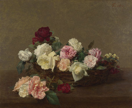
Peter Saville is a designer from England. His early graphic design work consisted of mainly album covers for Factory Records. He produced cover art for bands such as New Order, Joy Division, Martha and the Muffins and Suede. In this post i intend to focus on these album covers and especially the difference between his earlier work for New order and the latest. On the cover for the Power, Corruption and Lies by New Order produced in the 80's, Peter Saville used a version of "A Basket of Roses" by Henri Fantin - Latour. This is a form of appropriation as The painting of the roses was not originally produced by Peter Saville himself, it is just an image he has reappropriated for this album cover.
Continuing from my post on appropriation this shows that is used widely in art and design all the time. Sometimes it can cause chaos however in cases such as this it is accepted. Sometimes someone elses artwork can capture everything you are trying to show and designers choose to use the exisiting artwork, which can be seen as cheating.
On the cover for Power, Corruption and Lies, Saville has used code based on coloured squares to show the name of the band and album. This idea of the name being displayed used colour codes was a common theme seen on the artwork produced by Saville for New Order.

                                     http://farm6.static.flickr.com/5212/5484935775_57f836348b.jpg

Ignace-Henri-Théodore Fantin-Latour: 'A Basket of Roses'

In the album cover the colours in the flowers seem to have been enhanced, possibly to show the importance of colour in this album as that is what is being used to tell the viewer the name of the band and album.

Cover (Waiting for the Sirens' Call:New Order)
                                                     http://www.allmusic.com/album/r734334
This is the last artwork produced by Saville for New order on 2005. In comparison to the cover for Power, Corruption and Lies, typography seems to be the main subject for this album. However the colour of the writing is still striking, it just has not got the main focus of the viewer like the earlier album did. Looking at the two, it would be difficult to see the link between the artwork, but this could just be because the two albums are different in themselves.

References
http://www.btinternet.com/~comme6/saville/
http://en.wikipedia.org/wiki/Peter_Saville_(graphic_designer)

Thursday, April 7, 2011

Body Image


In this post i am going to look at the idea of body image for identity. However i am not going to look at female body image which, whilst still being important has been done to death. I am going to look at male body image. I am a female so i know i have been guilty of deciding whether or not a male, any male has the perfect body or face. In a study i discover it showed that 45 percent of men are dissatisfied with their body. This was only slightly less than women at 55 percent. In the same article where i got these statistics from there was a quote from a woman saying "it's only fair that men get a chance to see what its like to be us". I dont think thats right, men have always been men and in that sense have always been unhappy with their bodies. Just because they are "men" does not mean they dont actually have worries and fears about what they look like. Too thin, too tall, too fat and too short, these apply to men aswell. If we take a look at the models that can be seen in magazines.
http://www.persianmirror.com/Images/Articles/1468/CameronAlborzian1.jpg
You can see why some men may feel intimidated by what they see. However a large amount of preening must have been done to this male before the photograph was taken. Thats another clear sign that males are becoming more concerned about what they look like. Whereas before men tended not to spend time infront of the mirror moving individual strands of hair to the right place, now there are specific male grooming products, shavers and trimmers for their facial hair and even the odd manicure. We have all heard the phrase "sculptured jaw and cheekbones"
so lets look as some...

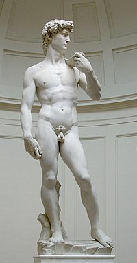
David von Michelangelo

                                                 http://en.wikipedia.org/wiki/David_(Michelangelo)

This is a statue sculptured by Michelangelo. This statue was produced to be aesthetically pleasing to its owner.Therfore the chances are that Michelangelo intended the male figure in this statue to be what a woman would want. Other images depicting the male figure are also made in the same way. They all have the perfect body, the perfect face and hair. And when we walk past or read a magazine and see the photograph of the half naked woman and feel a bit ashamed and depressed by our own body the chances are that the bloke infront has already clocked the men's health magazine.

http://www.infoplease.com/spot/mbi1.html

References
http://www.infoplease.com/spot/mbi1.html
http://en.wikipedia.org/wiki/David_(Michelangelo)
http://www.persianmirror.com/Images/Articles/1468/CameronAlborzian1.jpg

Friday, April 1, 2011

Chris Ofili Oficially

For the first of my biography posts i will look at Chris Ofili. Chris Ofili is a british painter born in Manchester. He studied at the Chelsea school of art. Ofili was a member of the Young British Artist group which was quite a big accomplishment. He became more and more popular and well known as his work was shown in more galleries. Ofili's work is very much to do with his Nigerian Background. He also has a very distinct style and after finding out that he had gone on a trip to Zimbabwe, i think this is where his technique came from.
File:Ofili-No-Woman.jpg
                                           http://en.wikipedia.org/wiki/File:Ofili-No-Woman.jpg
No Woman No Cry (1998) by Chris Ofili.


Chris Ofili
Afrodizzia (2nd version), 1996

In many of his paintings elephant dung was used in the painting of the images, which were built up with layers of paint aswell as other materials. Thus the paintings were built up like collages.

His work were also sometimes surrounded by controversy. In 1999 his painting "The Virgin Mary" was exhibited at the Brooklyn Musem of Art. This resulted in a lawsuit between the Mayor of New York City and the museum as the painting depicted a black madonna surrounded by offensive images, closeups of the female gentalia, pornographic images cut out of magazines as well as elephant dung.
image: She, 1997, Chris Ofili, Courtesy of Chris Ofili
                                                         Courtesy of Chris Ofili / Afroco


References


Semiotics

Semiotics refers to the studying of signs and includes studies into how we know what even the most simplest of signs means. It also has to do with language and the words we give certain things. We have grown up with these signs and our language and that is why we know that G-L-A-S-S refers to a container, generally of liquid, made out of the material glass.
This is a video i found made by a student and was shown at the Museum of Contemporary Art in 2008.
The video is about advertising semiotics and how advertisers use our knowledge of signs and language in order to pursuade us to buy certain products. Signs such as road signs are designed to make our lives easier and make it quicker for us to take in information, as instead or reading a sign telling us that we are able to go the national spead limit we see this and instantly know what to do.


There are three types of signs and these are. Icon, Index and symbol. An icon is a sign where the meaning directly relates to the sign through similarities and perhaps appearence.

An idex sign is when the meaning is related to the sign somehow. Or has a cause and effect relationship.

A symbol usually has an unrelated meaning. Whereby there is no cause and effect relationship and you cannot see any similarites between the sign and the meaning. This is how our language works.

Advertisments usually use signs to sell something to us really quickly. This is because they have to attract out attention, relay the idea or product to us and provide us with the information we need to buy the product in the short period of time we spend looking at individual posters. As we have become accustomed to trying to find a meaning in a symbol or image, signs are able to become more and more simple and take the form of an index sign.

References
http://www.youtube.com/watch?v=lLaQJ_Kr0UM
http://www.parkingpillocks.co.uk/images/national.gif