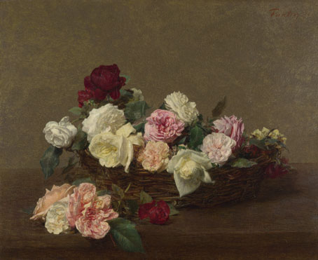
Peter Saville is a designer from England. His early graphic design work consisted of mainly album covers for Factory Records. He produced cover art for bands such as New Order, Joy Division, Martha and the Muffins and Suede. In this post i intend to focus on these album covers and especially the difference between his earlier work for New order and the latest. On the cover for the Power, Corruption and Lies by New Order produced in the 80's, Peter Saville used a version of "A Basket of Roses" by Henri Fantin - Latour. This is a form of appropriation as The painting of the roses was not originally produced by Peter Saville himself, it is just an image he has reappropriated for this album cover.
Continuing from my post on appropriation this shows that is used widely in art and design all the time. Sometimes it can cause chaos however in cases such as this it is accepted. Sometimes someone elses artwork can capture everything you are trying to show and designers choose to use the exisiting artwork, which can be seen as cheating.
On the cover for Power, Corruption and Lies, Saville has used code based on coloured squares to show the name of the band and album. This idea of the name being displayed used colour codes was a common theme seen on the artwork produced by Saville for New Order.
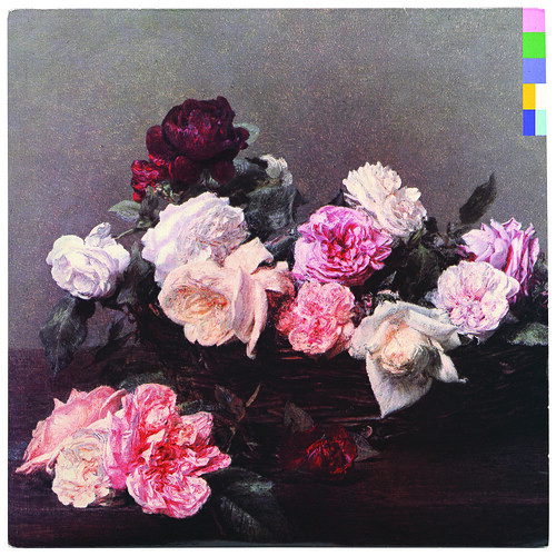
In the album cover the colours in the flowers seem to have been enhanced, possibly to show the importance of colour in this album as that is what is being used to tell the viewer the name of the band and album.

This is the last artwork produced by Saville for New order on 2005. In comparison to the cover for Power, Corruption and Lies, typography seems to be the main subject for this album. However the colour of the writing is still striking, it just has not got the main focus of the viewer like the earlier album did. Looking at the two, it would be difficult to see the link between the artwork, but this could just be because the two albums are different in themselves.
References
http://www.btinternet.com/~comme6/saville/http://en.wikipedia.org/wiki/Peter_Saville_(graphic_designer)
No comments:
Post a Comment