Friday, May 20, 2011

Danwen Xing


This is a model made by Danwen Xing. They are made with a large amount of detail especially considereing the actual size of the models themselves.
In my opinion the most interesting and intriguing part of these models are the littles areas of detail that you can see on the streets of the models or in some of the windows for example.
They are so small, making achieving the level of detail amazing. The series is called Urban fictions and in each of the models there is a scene with smaller models and characters in the scene.
As well as these models that she produced there are many other photography works. A particular one that i am interested in is the series Born with Cultural Revolution.

                                            http://www.danwen.com/web/works/born/index.html
In these photographs you can see the naked body of a woman standing in a room in front of a photograph of Chaiman Mao. In my opinion, this is a response to the leading of Chairman Mao and i think that it is her showing us, using the photograph, that she has no respect for Chairman Mao or his teachings. This could also be the case with the sheet or flag with the countries colours on it as it has been draped over her and she seems to show it very little respect in the way she is lying on it.
These are two very different series of work in my opinion, as one seems to  be quite comical with the scenes of murder or just normal everyday scenes compared to the expressive photographs of the other series.

This type of expressive work is not what i would associate with a Chinese artist living with Chairman Mao therefore i believe it is safe to say that this was a result of her time spent studying abroad in New York, as it is almost as though she had been "westernised" in her artwork.

References

Irma Boom

I had never heard of Irma Boom before now, but i instantly took a liking to her books. Irma Boom is a book maker from Gelderland in the Netherlands. After finding out how Boom goes about producing her books  and how she starts off the project by researching  her subject in great depth, i wanted to find out more about her and her work. Because of the time she spends researching the subject, the books usually take on the identity of the information Boom has found out. 

"Reading one of her books is like embarking on a visual adventure yet, by beginning each design project with rigorous research into the book’s contents and detailed discussions with its subjects, editor and author, Boom ensures that the aesthetic impact of her work is entirely empathetic with the text."

Irma Boom http://designmuseum.org/design/irma-boom
Book Designer (1960-)
The European Design Show
Design Museum Touring Exhibition


This shows how she wants the book to be almost a journey through the subject the book is about for the reader, and for the book to be undeniably a record of her reasearch and epitamize the subject.

SHV book, 1996
Irma Boom

SHV book, 1996
Irma Boom

These are images of the book she produced for SHV, a holdings company in the Netherlands. Whilst producing this book apparently she went to shareholders meetings, and  did further research for 3 and half years before starting production on the book.  In this way her books cannot be scrutinized for not being true to the subject as she has spent the time finding out the facts and getting the feel of the company  or brief she has been given.

“I can’t even work for someone telling me what size of book to make.” Irma Boom, http://designmuseum.org/design/irma-boom

This is a quote from Irma Boom after she completed the book for SHV. She feels it is difficult to the work to a brief after finishing the book as she had such freedom doing it for 5 years. This adds to the journey the reader feels as she was not working to a plan and was sort of on a journey herself as she produced it, so the readers would feel the same as they are reading.

References

Tuesday, May 3, 2011

Dan Friedman - Radical Modernism


Daniel Friedman is a Graphic designer known for his efforts to distance himself from the ideas of modernism and postmodernism. He even went on to publish a book titled Radical Modernism a title he himself came up with.
http://www.uartsgd.com/GD40/Friedman/DanFriedman.html


                                                                Three Mile Island
                                                       Painted lamp with found objects

                                                                         1985

                                                      Logo for exhibit: Radical Moderism
                                                        Moore College of Art and Design
                                                               1994,
Philadelphia, PA

Friedman believed that modernism was not very expressive as it had progressed. This work by Friedman shows how he brought his own ideas into his work and made it "exciting".

"Radical modernism is my reaffirmation of the idealistic roots of our modernity, adjusted to include more of our diverse cultures." In his text, Radical Modernism, Freedman illustrates his work in diverse mediums,- experimental furniture, sculpture, posters, logos, books, installations, typographic lessons, and his apartment. "Friedman argued that design was in crisis and urged designers to see their work in a larger cultural context..

This is a quote by Friedman expressing how he felt about the progression of the modernism.

Dan Friedman's work not only consists of the radical modernist design, posters and logo design, but also includes interior and product design which i am very interested in.

                                                           Friedman Apartment Interior
                                                                          NYC
                                                                  Interior Room Screen
                                                                    Painted fiberboard
Both these pieces are very expressive and would have, for some rejectors of the modernist era, been a welcome break.
Radical Modernism was not the only thing Daniel Friedman was known for. He was also one of the leading developers of the "New Typography" and "New Wave" movements. Which again further breaks free from the "rules" and traditions of design.   
 
References

Post modernism / Richter?

From my understanding, postmodernism is essentially the moving away from modernism. . Post modernism art is also art which is made using "non artistic" methods. In my opinion it involves a very wide range of things, such as modern architecture, modern design and paintings that are made just for the sake of it. From my reading i beleive that postmodernism was the name given to the period after modernism where artist tried to break away from the ideas of modernism completely.
An artist associated with the post modernist movement is Gerhard Richter, alhough he himself does not have the same belief.

Schütz: Stylistic changes, stylistic breaks, quotations and perhaps also irony — these are all phenomena which have been called "postmodern." Do confront these issues? Do you consider yourself a postmodern pioneer?

Richter: I don't believe so, it has not interested me that much. But in a certain sense you could call me so; because I never had that consciousness of belonging to the avant-garde, and it also was never a concern of mine. Avant-garde — I find that usually too dogmatic and aggressive.

http://www.jca-online.com/richter.html
This was taken from an interview with Richter. It shows that Richter does not believe that the work he produces should be put into this one catagory. It shows that the idea and movement of postmodernism is quite far removed from the avant-garde ideas of modernism. Therefore the question is posed, is the work produced by Richter post mordern even when he himself does not consider it to be?

Post modernism is also highly linked to architecture and the designs of 1960's. Experimentation with textures, symbolism and colour took place in house designs, thus a radical change in designs of houses and how they are built. When i think of a postmodern building, i picture a highly "modern" looking building and almost experimental in design.

References
http://www.jca-online.com/richter.html

Modern ism/ Post modernism - Modern Rebel


In short i believe that modernism can be defined as a change in the way art was produced following a rejection of all previous thoughts and feelings towards realism and traditional example of art. Enter "surrealism" and the "avant - garde" era. Artists such as Pablo Picasso were the leaders in this new way of looking and thinking about art. Producing artwork that was not a direct copy of a "lovey-dovey" scene or a pompous high class figure, sitting on a chair surrounded by their over priced worldy goods.

Pablo Picasso was the archetypal modern artist, and his work raises all sorts of questions about modernism. He was an artistic rebel who became fantastically wealthy. He was an experimental artist who hated much about the modern world, and his paintings, which so often baffled and shocked the establishment, are among the most reproduced images in the world ­ part of our visual language

Chris Nineham
Issue 204 of SOCIALIST REVIEW Published January 1997 Copyright © Socialist Review

In this article called "Modern Rebel - Pablo Picasso" Picasso is labelled a rebel, as he was one of the first artists to embrace this new style of producing artwork. I suppose rebel is an appropriate name as he broke away from the norm and the traditional methods and subjects of painting.


                                     http://www.artchive.com/artchive/P/picasso_protocubism.html
                                                 Pablo Picasso, 1908, Seated Woman

This is a painting made by Pablo Picasso in the early stage of Cubism. In my opinion this is obviously an early Cubist painting as the form of the woman is still recognisable however it is somewhat distorted by the lines cutting the image which is a recognisable trait of Cubist paintings.  From these early attempts at distoring images and breaking away from the realistic looking paintings, Picasso started his collage based Cubist work. Which in some respects, you could say took him full circle as what is more realistic that the object itself?

                                          Glass and Bottle of Suze (1912), Pablo Picasso

This is an observational painting of a Glass and bottle, however i do not think it is too bold to say that it is not immedietely clear. You can really see the transition from his early Cubist paintings to his later attempts, even if it was only in a space of a few years. I will follow on from this post quite fittingly with the next step on the timeline, Postmodernism!!!


References
http://www.ehow.com/facts_5751030_early-modernism_.html
http://pubs.socialistreviewindex.org.uk/sr204/picasso.htm
http://www.artchive.com/artchive/P/picasso_syntheticcubism.html

Monday, May 2, 2011

Daniel Rozin - Interaction Action

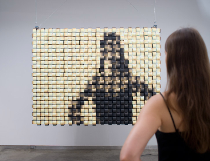
I first came across this designer not too long ago, when i went to the Decode Exhibition at the V & A. I was interested in interactive design, but didnt know very much about it. I was blown away by the interactive pieces that i saw there, especially the "Weave Mirror" produced by Daniel Rozin.
                                      Weave Mirror, Daniel Rozin V&A Decode Exhibition
                                      http://www.smoothware.com/danny/weavemirror.html

When someone stands infront of the mirror, the weaves change shape and position so that the person' s reflection would be shown in the mirror. It works and moves to show  the shape by the sounds that are made by the person standing in front and the movements that they make.


                                       http://www.smoothware.com/danny/weavemirror.html


Design and exhibitions like this show how design has changed and progressed from simple posters to interactive design such as this. More often than not when you they think of design people think of a simple poster, and typography. However design has changed to so much more than that as this exhibition shows.


Following on from my previous post, the change in technology and the public's taste and preference means that design and in particular advertising (such as the viral ads) has to change and progress as we do. I found this quote in an online discussion about the change in advertising to interaction design. This is the description for an event, talking about the change in design and advertising that took place in San Francisco.

"The future of advertising is in digital media, as people stop reading newspapers and people turn off their TVs in favor of Facebook, advertising agencies are struggling to redefine themselves as fast as the audience their trying to reach"  Added by IxDA San Francisco  November 2009


I think this sums up how and why design has to change and why it is doing so rapidly, in order to beat their competitors. By the time i get out of university what i know will be futile and obselite.

References
http://ixdasf.ning.com/events/interaction-design
http://www.vam.ac.uk/microsites/decode/exhibition
http://www.smoothware.com/danny/weavemirror.html
V & A Exhibition guide

Friday, April 29, 2011

Mad Ads

In this post i've chosen to look at adverts that have caught my attention. In a book i recently bought called the one show which is basically a catalogue rating and awarding medals to different pieces of design work, there was an ad for durex. It caught my eye because of the cleverness of it.
                                                                                                              http://farm1.static.flickr.com/45/147761320_b45ad32aa4.jpg


I immediately took a liking to this as the photography is insinuating something quite rude that some viewers may take offence to, however it is not actually saying it. It also means that the viewer has to work a little harder to work out the meaning of the advert, however once they are aware of what the photography implies, it matches the brand that it is advertising well. This said i think that in the absence of the durex logo on the bottom of the image, the product that the adverts are trying to sell would become unclear. I researched some other "clever" adverts, below are some of the adverts i have found, which i believe shows how advertising has changed with the change of technology, and change in people tastes and preferences.


                          http://www.thecoolnews.org/wp-content/uploads/2008/02/image0011.jpg

This advert is clever in the way it is communicating the idea to us, however it is also immediately clear what it is trying to tell the viewer. This is what makes this advert work well and effectivelly. Viral ads work in the same way whether they are on the internet or on the street, as they are able to capture the publics attention quickly and relay their idea.


                                 http://farm3.static.flickr.com/2018/1725723599_1f9f9256f3.jpg
Adverts such as this are much more effective at making a person more interested in purchasing a certian item or making them aware of a product. Aswell as being placed in a populated and well used area, the directors have used an area that would normally and had traditionally not been used for advertising. By choosing this method of advertising and subsequently making people laugh they are advertising to a wider audience and would be much more likely to appeal to a person than a simple poster would. Therefore in my opinion and im sure many others, a viral ad that not only provides information about the product but offers more enticement and even comedy is a much more effective means of selling or promoting a product or even an event.

Wednesday, April 27, 2011

Who is Peter Saville


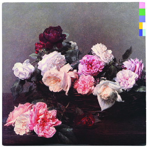
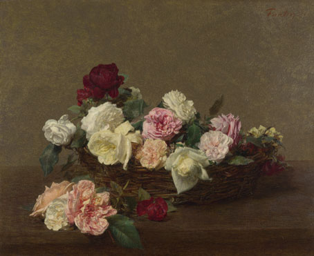
Peter Saville is a designer from England. His early graphic design work consisted of mainly album covers for Factory Records. He produced cover art for bands such as New Order, Joy Division, Martha and the Muffins and Suede. In this post i intend to focus on these album covers and especially the difference between his earlier work for New order and the latest. On the cover for the Power, Corruption and Lies by New Order produced in the 80's, Peter Saville used a version of "A Basket of Roses" by Henri Fantin - Latour. This is a form of appropriation as The painting of the roses was not originally produced by Peter Saville himself, it is just an image he has reappropriated for this album cover.
Continuing from my post on appropriation this shows that is used widely in art and design all the time. Sometimes it can cause chaos however in cases such as this it is accepted. Sometimes someone elses artwork can capture everything you are trying to show and designers choose to use the exisiting artwork, which can be seen as cheating.
On the cover for Power, Corruption and Lies, Saville has used code based on coloured squares to show the name of the band and album. This idea of the name being displayed used colour codes was a common theme seen on the artwork produced by Saville for New Order.

                                     http://farm6.static.flickr.com/5212/5484935775_57f836348b.jpg

Ignace-Henri-Théodore Fantin-Latour: 'A Basket of Roses'

In the album cover the colours in the flowers seem to have been enhanced, possibly to show the importance of colour in this album as that is what is being used to tell the viewer the name of the band and album.

Cover (Waiting for the Sirens' Call:New Order)
                                                     http://www.allmusic.com/album/r734334
This is the last artwork produced by Saville for New order on 2005. In comparison to the cover for Power, Corruption and Lies, typography seems to be the main subject for this album. However the colour of the writing is still striking, it just has not got the main focus of the viewer like the earlier album did. Looking at the two, it would be difficult to see the link between the artwork, but this could just be because the two albums are different in themselves.

References
http://www.btinternet.com/~comme6/saville/
http://en.wikipedia.org/wiki/Peter_Saville_(graphic_designer)

Thursday, April 7, 2011

Body Image


In this post i am going to look at the idea of body image for identity. However i am not going to look at female body image which, whilst still being important has been done to death. I am going to look at male body image. I am a female so i know i have been guilty of deciding whether or not a male, any male has the perfect body or face. In a study i discover it showed that 45 percent of men are dissatisfied with their body. This was only slightly less than women at 55 percent. In the same article where i got these statistics from there was a quote from a woman saying "it's only fair that men get a chance to see what its like to be us". I dont think thats right, men have always been men and in that sense have always been unhappy with their bodies. Just because they are "men" does not mean they dont actually have worries and fears about what they look like. Too thin, too tall, too fat and too short, these apply to men aswell. If we take a look at the models that can be seen in magazines.
http://www.persianmirror.com/Images/Articles/1468/CameronAlborzian1.jpg
You can see why some men may feel intimidated by what they see. However a large amount of preening must have been done to this male before the photograph was taken. Thats another clear sign that males are becoming more concerned about what they look like. Whereas before men tended not to spend time infront of the mirror moving individual strands of hair to the right place, now there are specific male grooming products, shavers and trimmers for their facial hair and even the odd manicure. We have all heard the phrase "sculptured jaw and cheekbones"
so lets look as some...

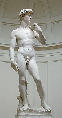
David von Michelangelo

                                                 http://en.wikipedia.org/wiki/David_(Michelangelo)

This is a statue sculptured by Michelangelo. This statue was produced to be aesthetically pleasing to its owner.Therfore the chances are that Michelangelo intended the male figure in this statue to be what a woman would want. Other images depicting the male figure are also made in the same way. They all have the perfect body, the perfect face and hair. And when we walk past or read a magazine and see the photograph of the half naked woman and feel a bit ashamed and depressed by our own body the chances are that the bloke infront has already clocked the men's health magazine.

http://www.infoplease.com/spot/mbi1.html

References
http://www.infoplease.com/spot/mbi1.html
http://en.wikipedia.org/wiki/David_(Michelangelo)
http://www.persianmirror.com/Images/Articles/1468/CameronAlborzian1.jpg

Friday, April 1, 2011

Chris Ofili Oficially

For the first of my biography posts i will look at Chris Ofili. Chris Ofili is a british painter born in Manchester. He studied at the Chelsea school of art. Ofili was a member of the Young British Artist group which was quite a big accomplishment. He became more and more popular and well known as his work was shown in more galleries. Ofili's work is very much to do with his Nigerian Background. He also has a very distinct style and after finding out that he had gone on a trip to Zimbabwe, i think this is where his technique came from.
File:Ofili-No-Woman.jpg
                                           http://en.wikipedia.org/wiki/File:Ofili-No-Woman.jpg
No Woman No Cry (1998) by Chris Ofili.


Chris Ofili
Afrodizzia (2nd version), 1996

In many of his paintings elephant dung was used in the painting of the images, which were built up with layers of paint aswell as other materials. Thus the paintings were built up like collages.

His work were also sometimes surrounded by controversy. In 1999 his painting "The Virgin Mary" was exhibited at the Brooklyn Musem of Art. This resulted in a lawsuit between the Mayor of New York City and the museum as the painting depicted a black madonna surrounded by offensive images, closeups of the female gentalia, pornographic images cut out of magazines as well as elephant dung.
image: She, 1997, Chris Ofili, Courtesy of Chris Ofili
                                                         Courtesy of Chris Ofili / Afroco


References


Semiotics

Semiotics refers to the studying of signs and includes studies into how we know what even the most simplest of signs means. It also has to do with language and the words we give certain things. We have grown up with these signs and our language and that is why we know that G-L-A-S-S refers to a container, generally of liquid, made out of the material glass.
This is a video i found made by a student and was shown at the Museum of Contemporary Art in 2008.
The video is about advertising semiotics and how advertisers use our knowledge of signs and language in order to pursuade us to buy certain products. Signs such as road signs are designed to make our lives easier and make it quicker for us to take in information, as instead or reading a sign telling us that we are able to go the national spead limit we see this and instantly know what to do.


There are three types of signs and these are. Icon, Index and symbol. An icon is a sign where the meaning directly relates to the sign through similarities and perhaps appearence.

An idex sign is when the meaning is related to the sign somehow. Or has a cause and effect relationship.

A symbol usually has an unrelated meaning. Whereby there is no cause and effect relationship and you cannot see any similarites between the sign and the meaning. This is how our language works.

Advertisments usually use signs to sell something to us really quickly. This is because they have to attract out attention, relay the idea or product to us and provide us with the information we need to buy the product in the short period of time we spend looking at individual posters. As we have become accustomed to trying to find a meaning in a symbol or image, signs are able to become more and more simple and take the form of an index sign.

References
http://www.youtube.com/watch?v=lLaQJ_Kr0UM
http://www.parkingpillocks.co.uk/images/national.gif

Monday, February 14, 2011

Appropriation

Appropriation - The act of using elements such as objects and artworks for example, that are not your own, to create a new piece of work. It can be literally defined as taking something over and making it your own in your personal work and there are many ways this can be done such as a pastiche. Artists such as Picasso and Georges Braque used everyday objects in their work bringing the real world into their work. This idea was also worked on by Duchamp who's piece "Fountain" consisted of a men's urinal. These artists used already existing objects made by others in their work.


Marcel Duchamp Fountain 1917, replica 1964


Fountain by Marcel Duchamp  (1917)


File:Compotier avec fruits, violon et verre.jpg
                                                Compotier avec fruits, violon et verre by
                                                               Pablo Picasso (1912)
                                       http://en.wikipedia.org/wiki/File:Compotier_avec_fruits,_violon_et_verre.jpg

Newspapers and other objects have been used in this work by Picasso. He has appropriated these objects and made them his own.


There is often a thin line between what is legal and illegal in appropriational art. During the election campaign of Barrack Obama, a poster was produced by Shepard Fairey using a copyrighted photograph taken by someone else. This caused controversy and led the Obama capmaign to dissasociate themselves with the poster produced by Fairey. After the campaign, the style and idea have been used by others to produce similar posters. This is often done as if a poster or design is popular, it is beneficial for an artist to use the popular image to attract viewers to their own work. However this is illegal and some artists have taken others to court over use of their designs or ideas.


                                                           "HOPE" Shepard Fairey
                          http://blackfishart.blogspot.com/2010/08/political-art-and-politics-of.html

                                                        Front page of the Sun newspaper
                                                      http://static.guim.co.uk/sys-images/Guardian/Pix/pictures/2010/5/5/1273100204265/Election-Day-Front-Pages-009.jpg

References
http://static.guim.co.uk/sys-images/Guardian/Pix/pictures/2010/5/5/1273100204265/Election-Day-Front-Pages-009.jpg
http://blackfishart.blogspot.com/2010/08/political-art-and-politics-of.html
http://en.wikipedia.org/wiki/File:Compotier_avec_fruits,_violon_et_verre.jpg
http://www.tate.org.uk/servlet/ViewWork?workid=26850
http://www.tate.org.uk/collections/glossary/definition.jsp?entryId=23